

Project Overview
The challenge
A small boutique wine business in Indianapolis bought a second location. The new location was currently operating as a similar shop. The two businesses had separate website URLs. The owner wanted to merge these sites together while showcasing the two locations as separate stores, featuring some different items, but keeping the overall idea and branding cohesive at both locations. The site also needed to have the option to add an online store in the future that would allow for separate inventory selection per location.
During this same time, very large corporate company moved into the area, building two locations. Keeping customers shopping at Sadler Wine Markets was first priority.
the solution
I decided it would be best to create a new brand to act as a “parent” company and face of the website, then showcase the two locations on a dedicated locations page within the site. Other aspects of the site, like the events page, gift options, wine club member info, etc. would exist as part of the singular “parent” brand.
I researched the customers for both locations to determine the similarities and differences, then built the site to cater to both customer bases while projecting a unified brand. This research would allow me to figure out how and why customers shop at this locally owned business over the corporate retailers in the area.
I designed the site to allow for the future addition of an e-commerce store — both for local delivery and pick-up, as well as shipping.
My Role
Lead designer and engineer
Tools
Google Forms
User Brain
Adobe XD
WordPress
Power Point
Good Notes
Timeline
E-commerce addition 2023
phase 1
define the challenge & scope
A small wine shop, Tasteful Times, located in the suburbs of Indianapolis, IN was going to purchase a second location within the city. This second location, Cork and Cracker, was a well established wine shop currently owned by another local resident. The challenge was to create a new website that would allow for a single “parent” brand (Sadler Wine Markets) to exist while still keeping the other two location names as they were previously. The site needed to present each store separately with info about the location and history but under the same Sadler Wine Markets brand. The old URLs for each store’s website also needed to be redirected to the new site URL.
It was important to understand if there were differences between these locations, and how best to attempt to unify the brands. The owner stated that he may want to eventually remove the individual branding and use just the Sadler Wine Markets brand for both locations. He also stated that he has intention to purchase a third location in the area in the future.
The two stores had different point of sale systems initially which created another challenge for tracking inventory and the proposed e-commerce component. This addition would be postponed until the two systems could be aligned in the near future. This aspect of the project is ongoing and is set to be completed summer 2023.
phase 2
identify & understand the users
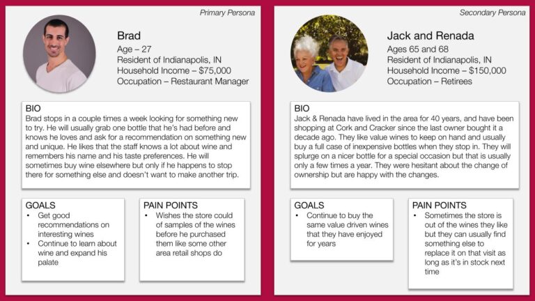
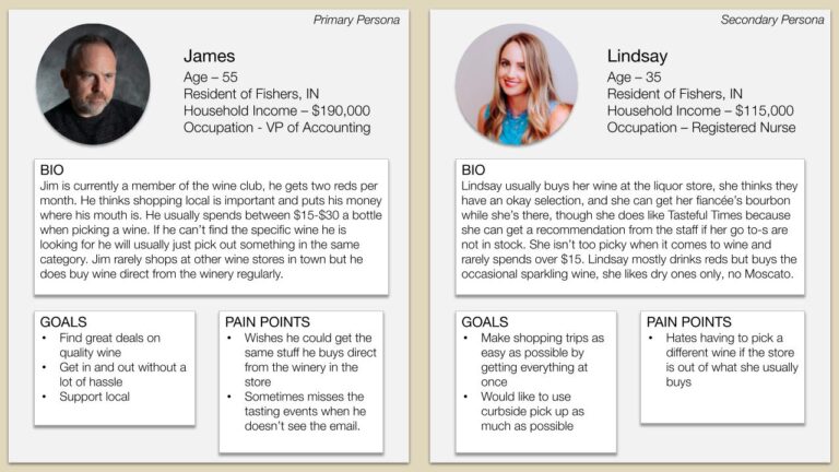
Surveys and in-person interviews were conducted with current customers. An email was sent out with a link to a survey form that received ~70 responses. From this we were able to gather demographic data, product preferences, and purchase habits. In-person interviews were also conducted with costumers in the store. These were quick, on-the-spot interviews that ranged from short one-question interactions to longer conversations about customer habits and preferences. Once possession of the second location was acquired, we repeated the survey and interviews with those customers. We were also able to use sales data to help formulate a picture of the similarities and differences between the two locations.
We found that there were different demographics and preferences at each store. One location sold less quantity but higher priced items, while the other location sold more items but at a lower price point. The taste preferences were also slightly different between the stores.
Many customers were loyal to the owner and would shop at his store over the new corporate retailer in the area, but others still bought many items direct from wineries online. People preferred shopping at these small boutique stores, because of the customer service they received, over grocery and larger corporate companies.
We identified certain promotions that customers at the new store shopped often — these would need to remain as everyday deals. When the new point of sale system was installed at both locations, the promotions were set to be automatically applied and were uniform across both locations. Once these were being applied at both locations, information about these promotions were added to the website. Helping the further unite the brands.
Customer personas were created to better educate the owner on who his clientele were at the different locations and to help define what was most important to highlight on the site in order to accommodate users of both stores.
phase 3
design & build
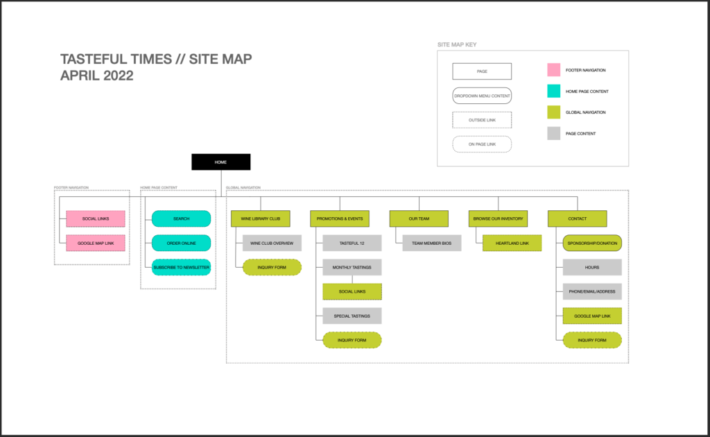
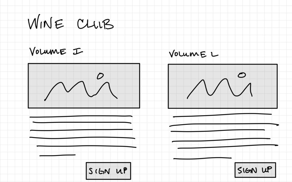
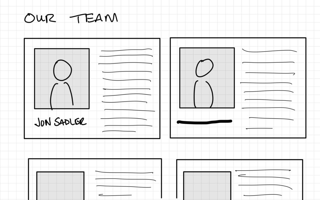
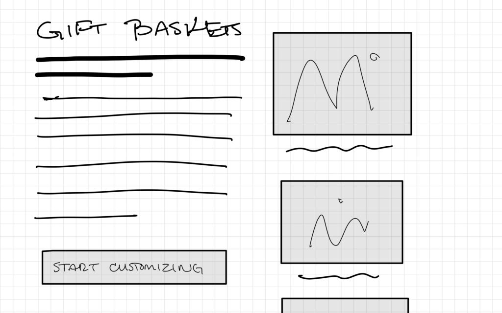
The starting point was understanding what was on the current site and which aspects needed to be changed, updated, or added. We also identified what currently worked and should be kept the same. We identified several key navigation aspects that would remain – information about the wine club, events, info about the staff, and contact options. We also identified additions that would be made, most importantly a page identifying the two locations as well as a page promoting the gift baskets that the store assembled.
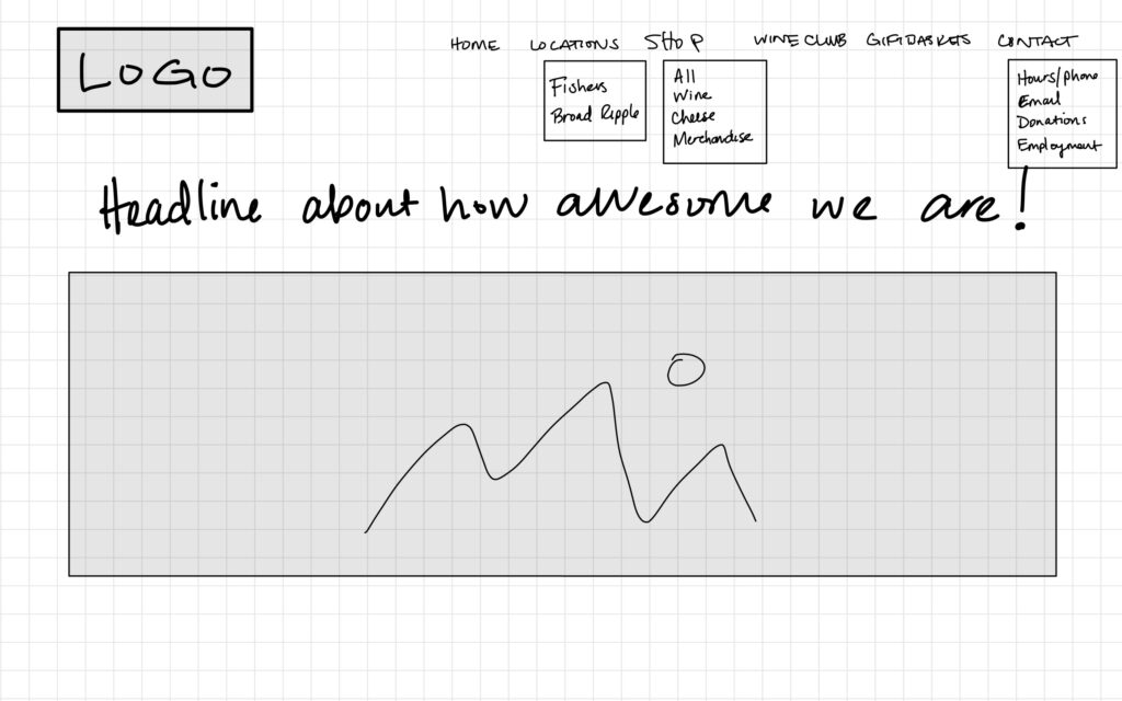
Next lo-fi wireframes were created for the new site and tested using Chalkmark. These tests showed whether users were able to navigate through simple workflows.
After testing the wireframes, a few small changes were made. The drop down menus were eliminated because we found that many were superfluous or users simply scrolled to the bottom to look for their navigation link in the main content section or footer if they did not immediately see it in the header navigation. We also deemed certain aspects of the dropdown menu content to be less relevant to regular user needs (like donation request forms).
phase 4
test & re-design
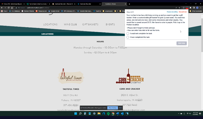
Once the site was built, remote usability testing was done with 5 participants. Participants were given 10 tasks to complete that included navigating to the location page, signing up for the wine club using an embedded form, etc. Once testing was complete, each recording was analyzed and changes were made according to where people struggled the most and other feedback made during the tests.
The following changes were made based on usability testing:
- Certain phrasing was changed to make navigation and information more clear. For example “events and promotions” was shortened to just “events” as the promotions were no longer on that page and would be applied to the home page.
- The location hours were added to the top of the home page according to feed back from 3 of 5 test participants that this was a top priority they would be looking for when visiting the site.
- Sign up buttons were removed from between each wine club description and applied only once to the bottom – participants said that having them after each was confusing since there was only one form to apply for all with checkboxes to select which club(s) the user wanted to join.
- Some color and style adjustments were made based on participant preferences and desire for a less busy interface.
phase 5
launch
Once we were satisfied with the changes made to the design after testing we launched the website. We redirected the two original URLs to the new site and updated the Google Business Account info for both locations.
It was important to tailor this first site to the current brick and mortar customers that would be shopping with the business while keeping in mind that the owner wants to add e-commerce first in the form of local pick-up and delivery and the expand to ship out of state as the business grows and more and more people continue to shop online.
We continue to update the website as needed and will be adding a user survey to the site once the first phase of the e-commerce goes live.